Saturday, April 2, 2011
00Grizzly
You may remember this little gem that I posted in December. I guess I got so swept up in 2011 fever that I forgot to post the finished version. I'm sure glad I didn't cross paths with this guy while camping in the redwoods last week. I would have felt so under-dressed.
Wednesday, March 30, 2011
Visiting Artist
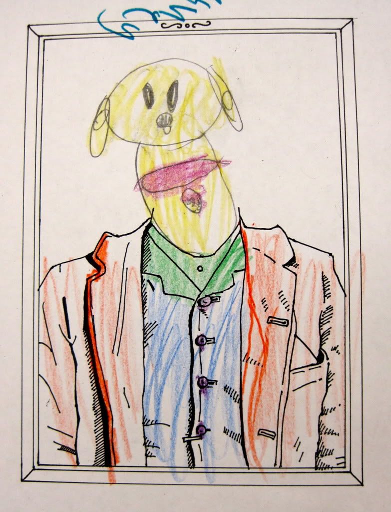
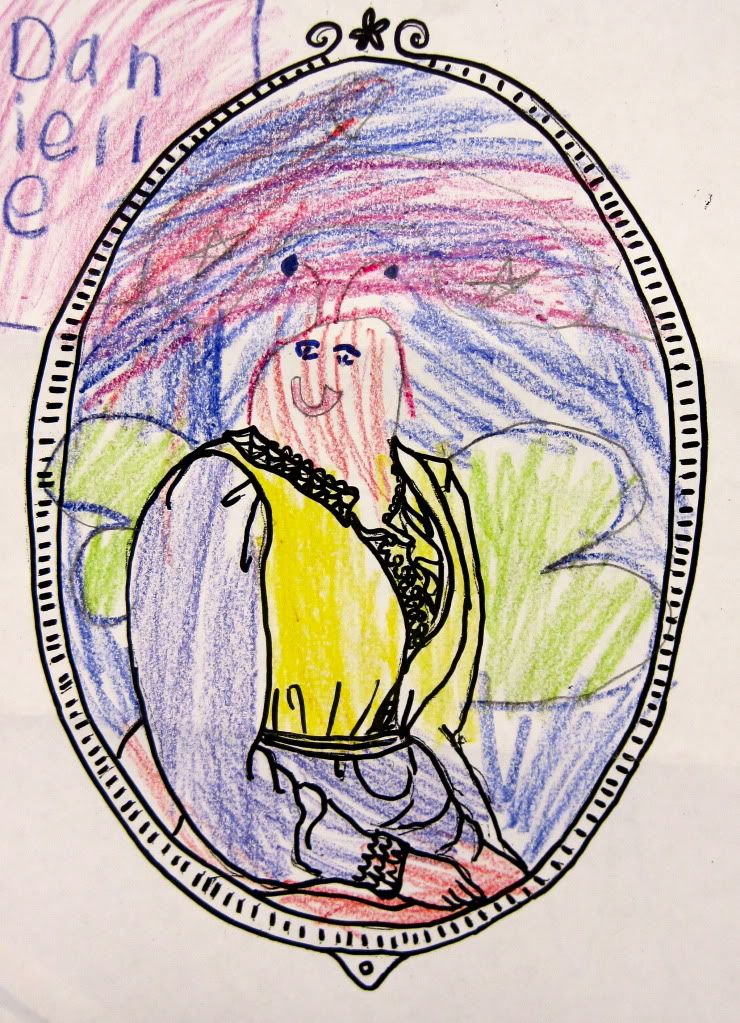
Back in February I got to be the visiting artist at the Campfire USA after school program for Kindergardeners and 1st graders. You may have seen the awesome art installation they did for the Emerson Space Case earlier this year. Of course all of this was coordinated by their lovely teacher, Stephanie.
We began the presentation by showing them examples of my art and talking about my process. We then had a quick Q and A session (very funny with 5 year olds) and moved on to the best part. An activity that Stephanie and I prepared for them.
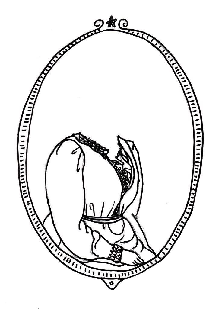
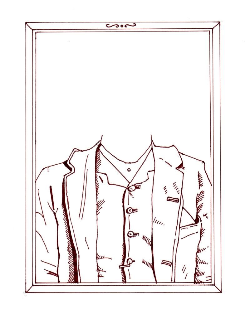
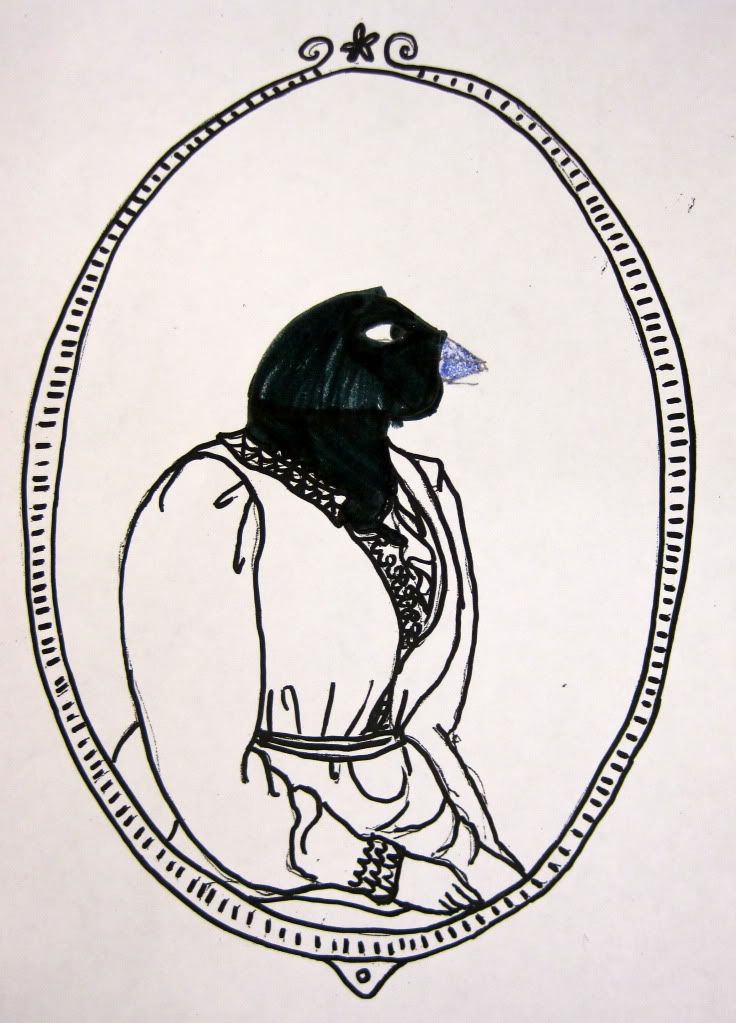
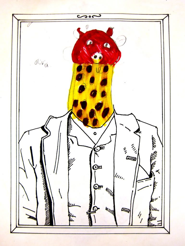
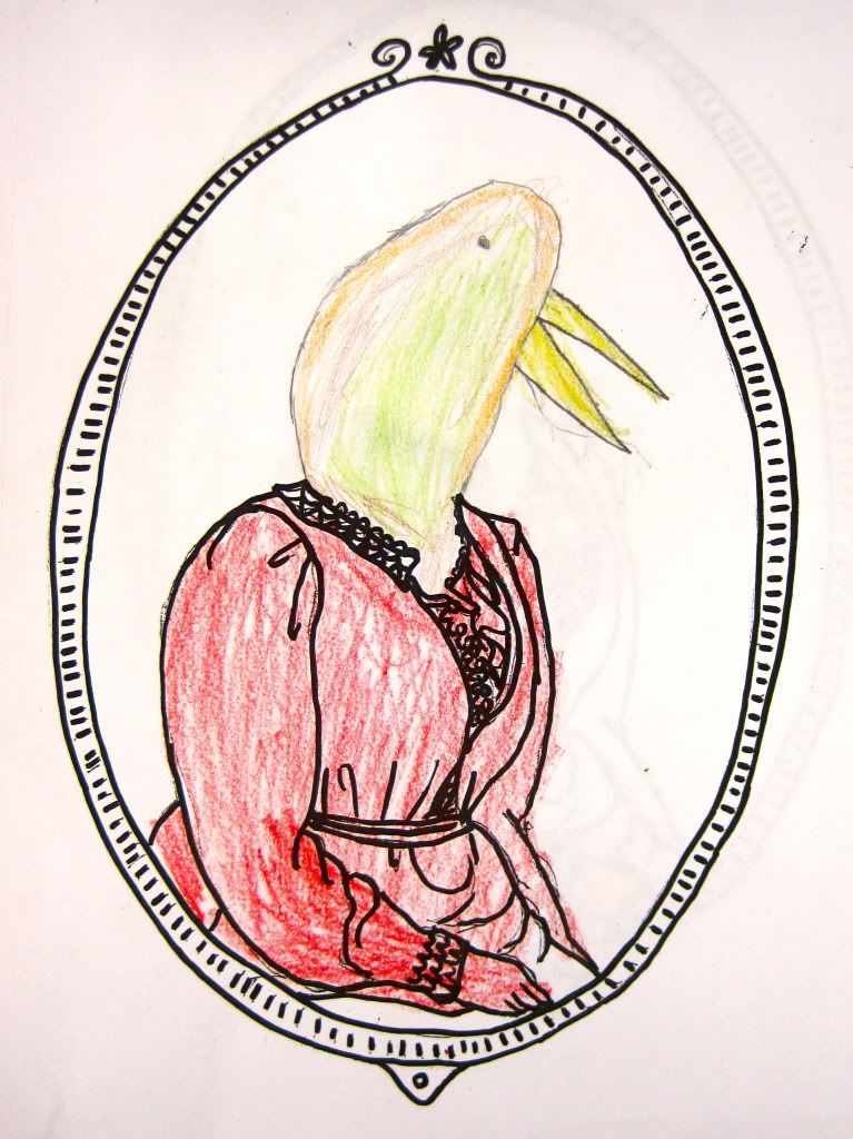
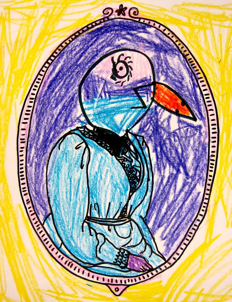
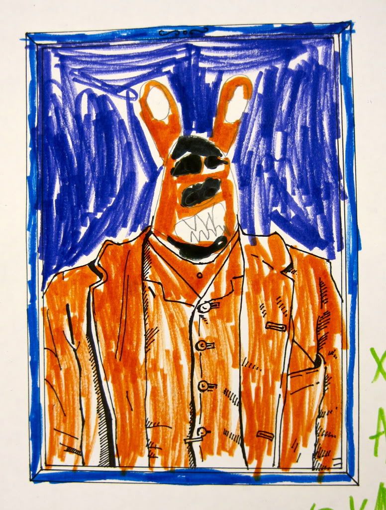
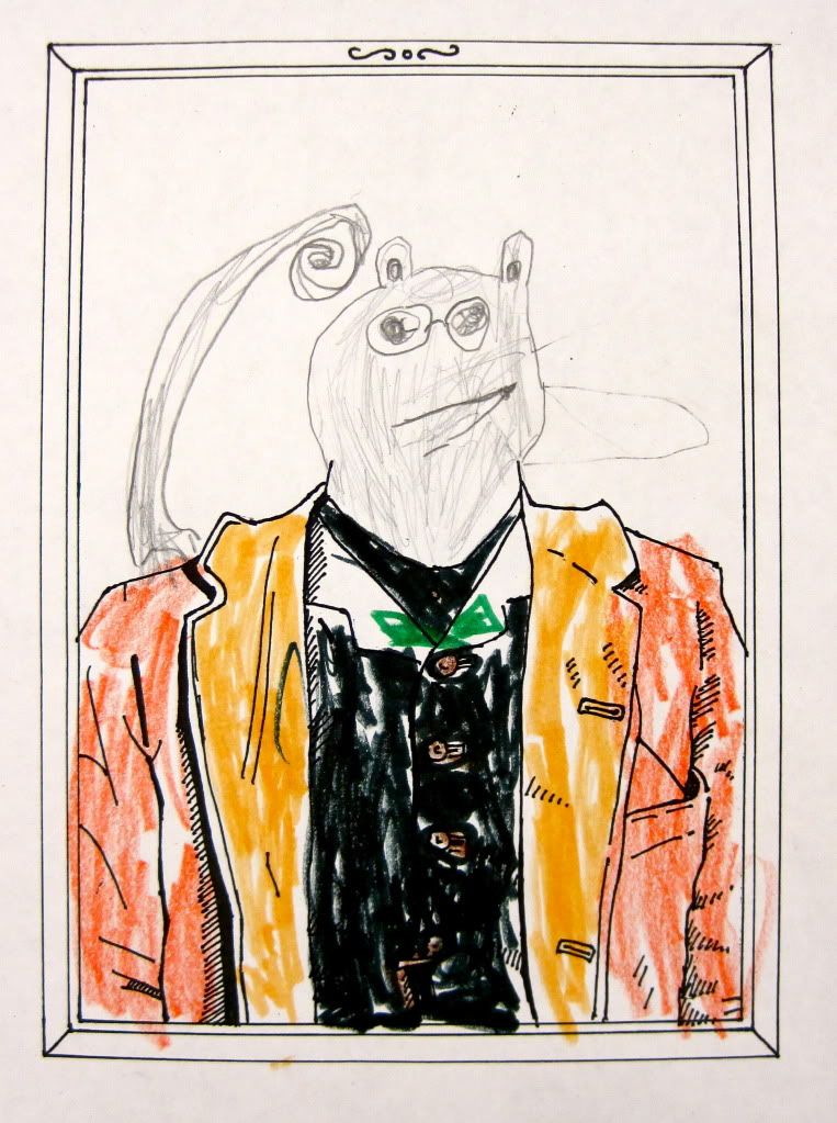
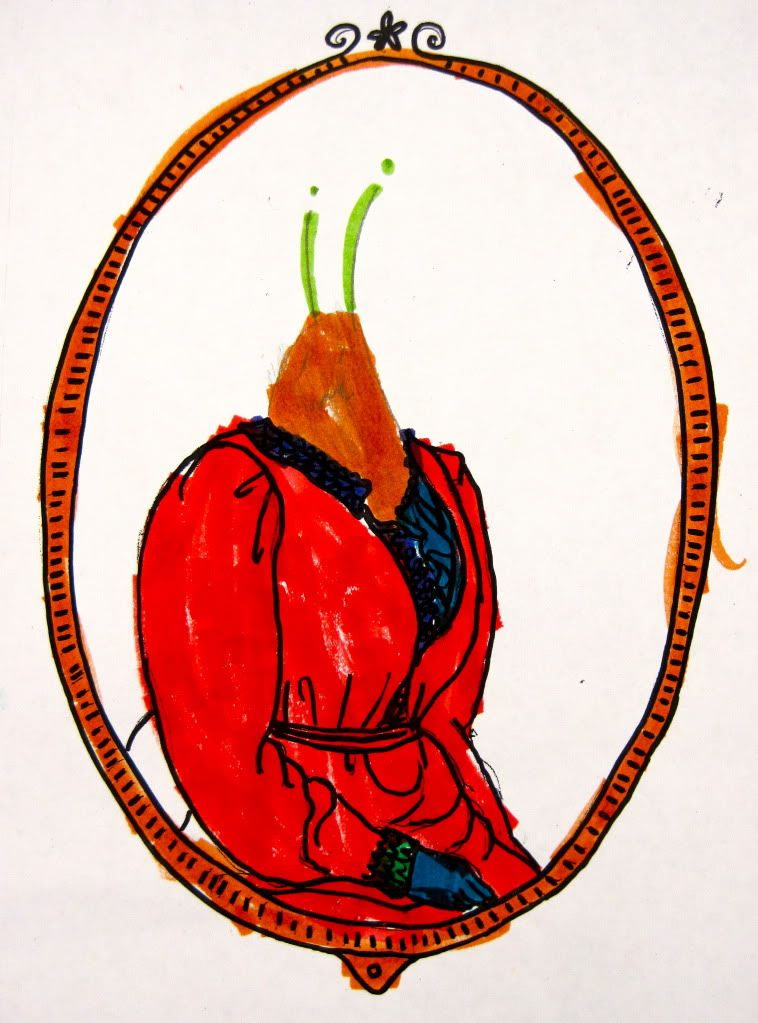
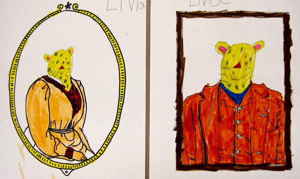
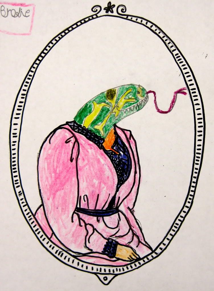
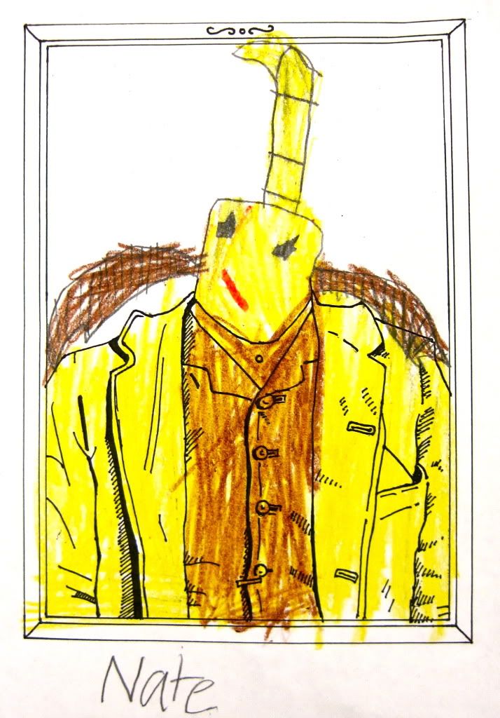
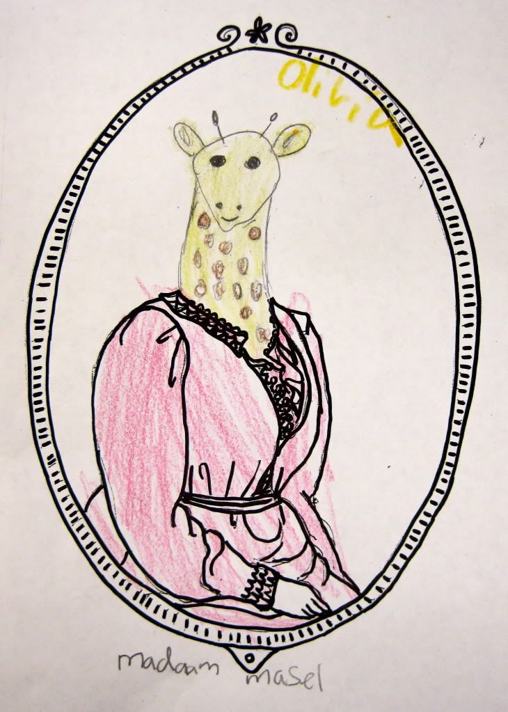
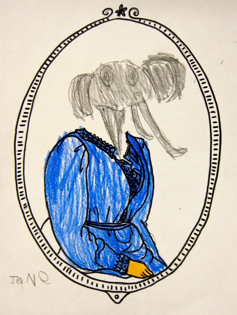
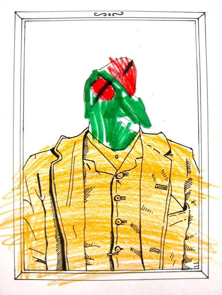
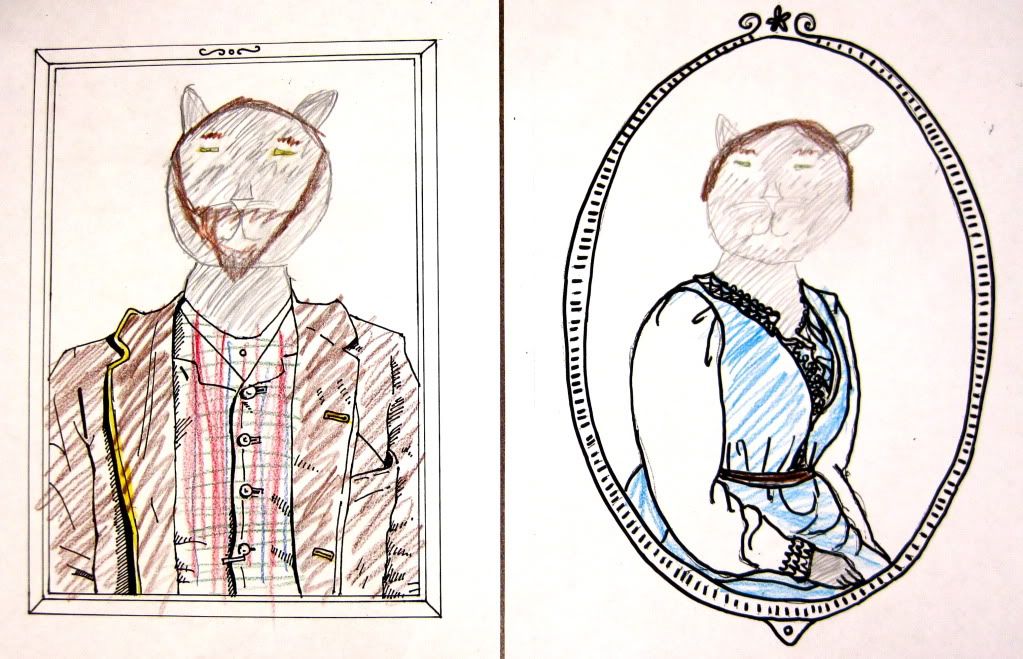
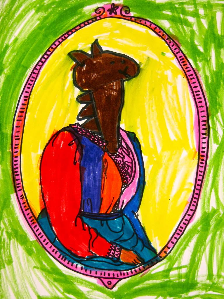
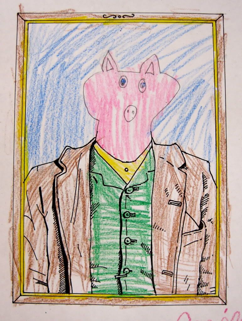
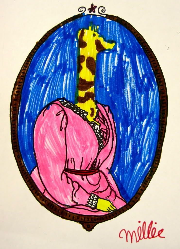
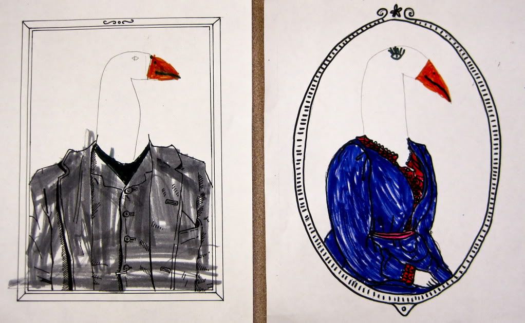
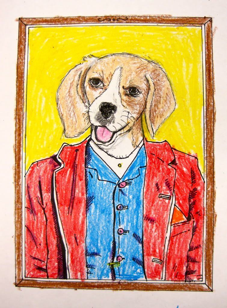
As you can see we each drew a framed headless torso and made tons of copies of them, leaving it to the kids to fill in the head of their favorite animal. I was really excited to see what they would come up with, and the kids did not disappoint. Here are some examples.
And of course Stephanie and I wanted to get in on the fun too. If you want to make your own just open up the headless templates in a new window and print or save to your computer. I'll post up any that get sent to me on the blog.
Monday, March 28, 2011
The Evolution of an Illustration
Well I'm back from my vacation to the Redwoods of Northern California, and ready to get back to blogging. Here's a few early versions of my illustration for the Portland Mercury, as well as the final product.
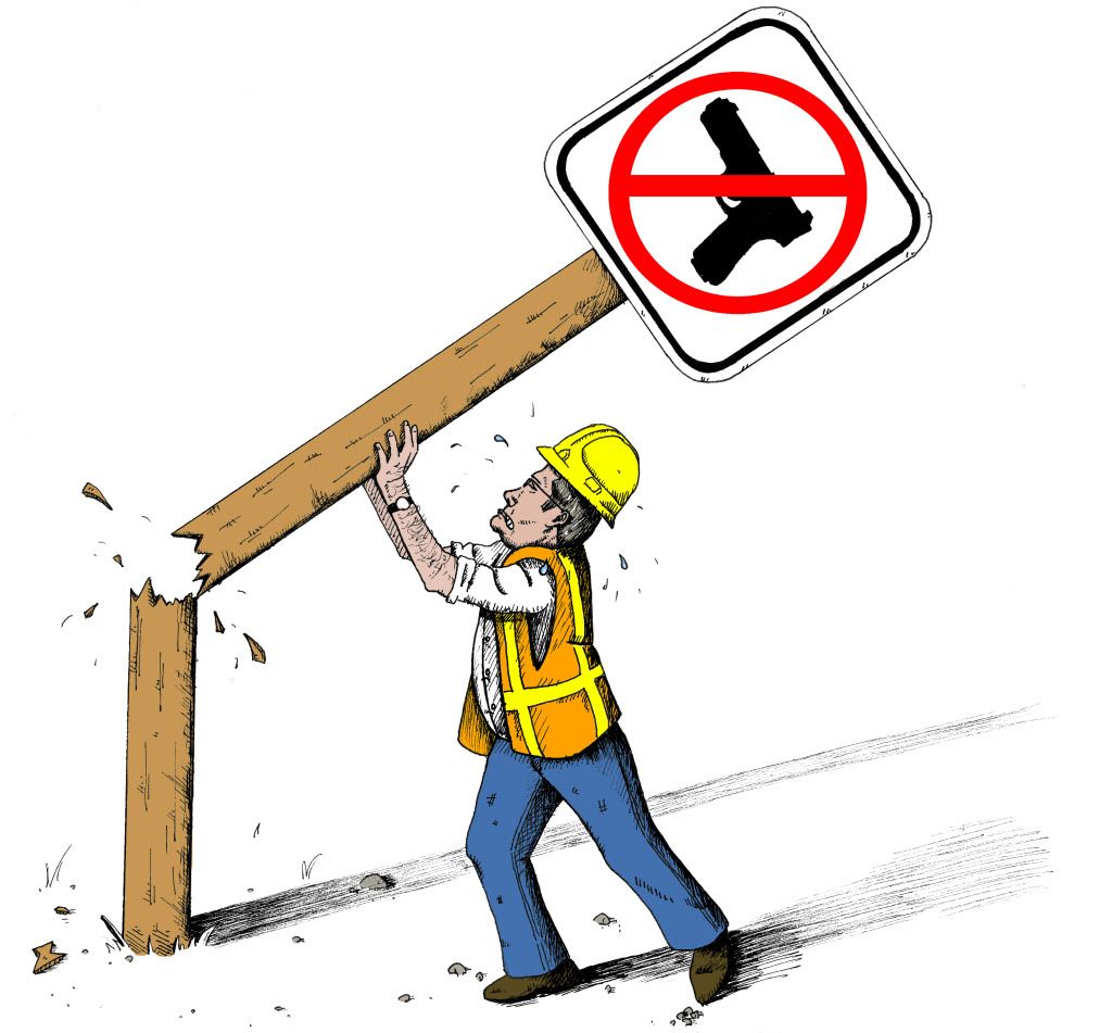
As you can see I originally drew the sign breaking, but this added element skewed the message of the piece and the Art Director asked me to redraw it with the sign intact.
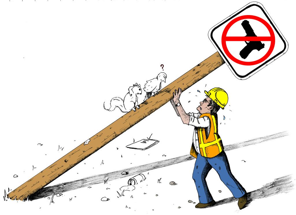
I got a little overzealous in this second version and in an effort to create a whole scene threw in a lot of extra elements that ultimately distracted from the point of the illustration. Plus the printed size of the drawing would make it very difficult to see any of these details clearly. I decided to go for something a little simpler.
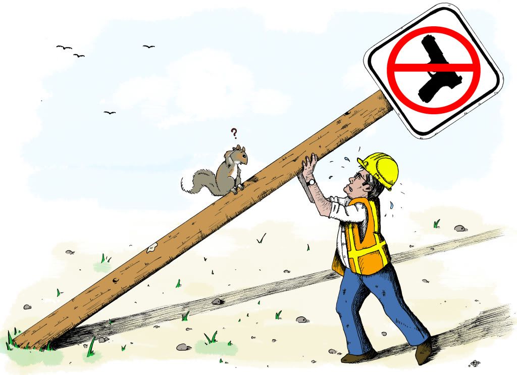
And here we have the final version. All of the extraneous details have been eliminated and some birds were added to the left corner to balance out the composition. This took me way longer than I would have liked it to, but now that I have the hang of it I think the next one will probably take half the time. Let's just hope there IS a next time!
Subscribe to:
Posts (Atom)