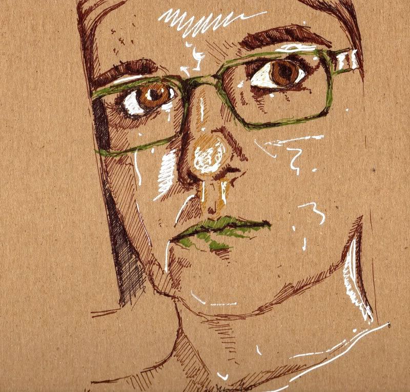
I did this sketch of Lily before starting on the final one to see how the colors were going to work together. In some ways I like this one more. It's looser and has a greater resemblance to the real life Lily. As you can see I opted not to use white out for the highlights on the final piece. It seemed like it was more distracting than anything else. Just a few more promo portraits to go, now!

No comments:
Post a Comment